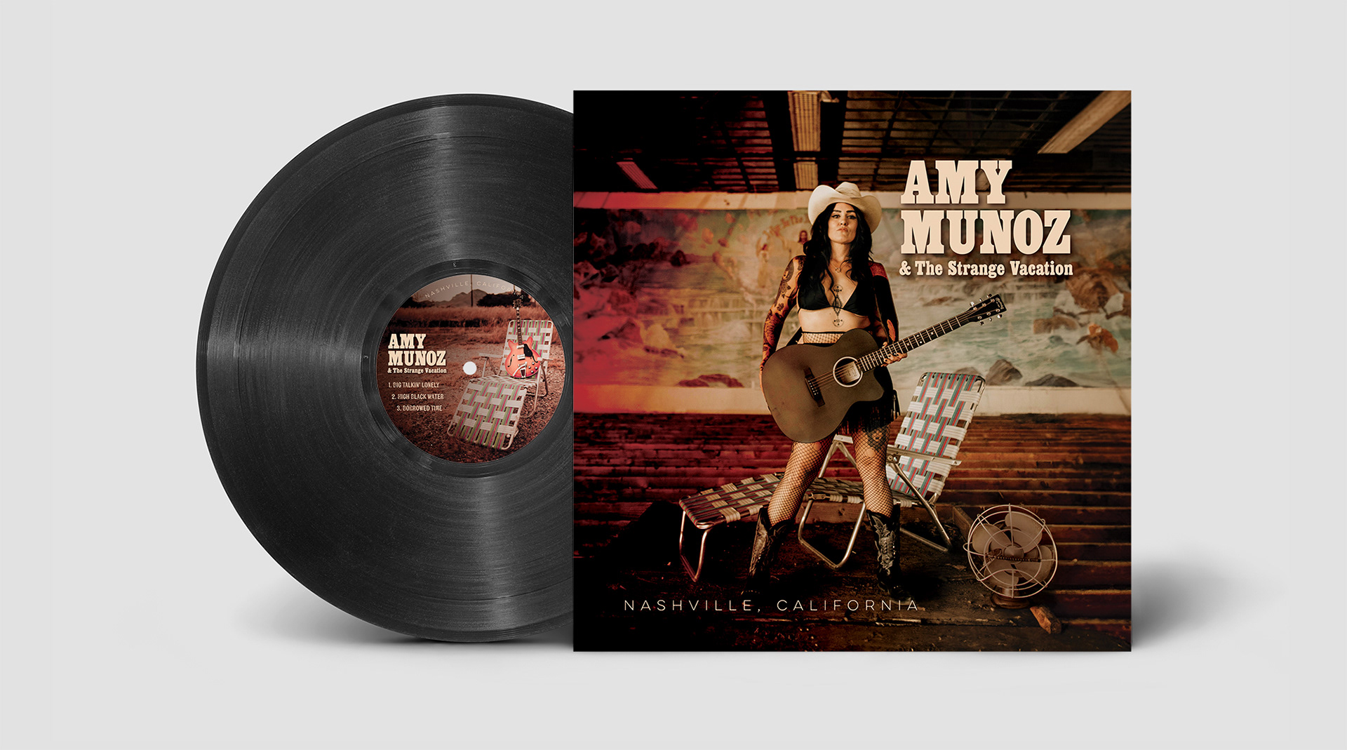
When Amy Munoz and The Strange Vacation set out to make Nashville, California, I had the joy of designing the CD and vinyl packaging. My goal was to bring the warmth, grit, and storytelling of her music to life visually.
Amy Munoz is a Tucson-based rock vocalist and multi-instrumentalist whose sound weaves together rock, blues, country, and punk. I feel lucky to have a personal connection to Amy’s music. I played drums in two of her earlier bands, Mozart’s Sister and the HypnoGogs, back in the mid-2000s. Because Amy and I go way back as friends and bandmates, working on this album together just felt natural and really fun.
Project Overview
The design direction emerged from Kayla Von Der Heide’s evocative photography, the band’s recording experience at Sonic Ranch, and the spirit of the album title, Nashville, California. The title suggests a unique meeting point of country warmth and rock-and-roll edge, which became central to the visual concept.
The goal was to create album artwork that felt atmospheric, tactile, and inviting while reflecting the record's sound.

Creative Direction
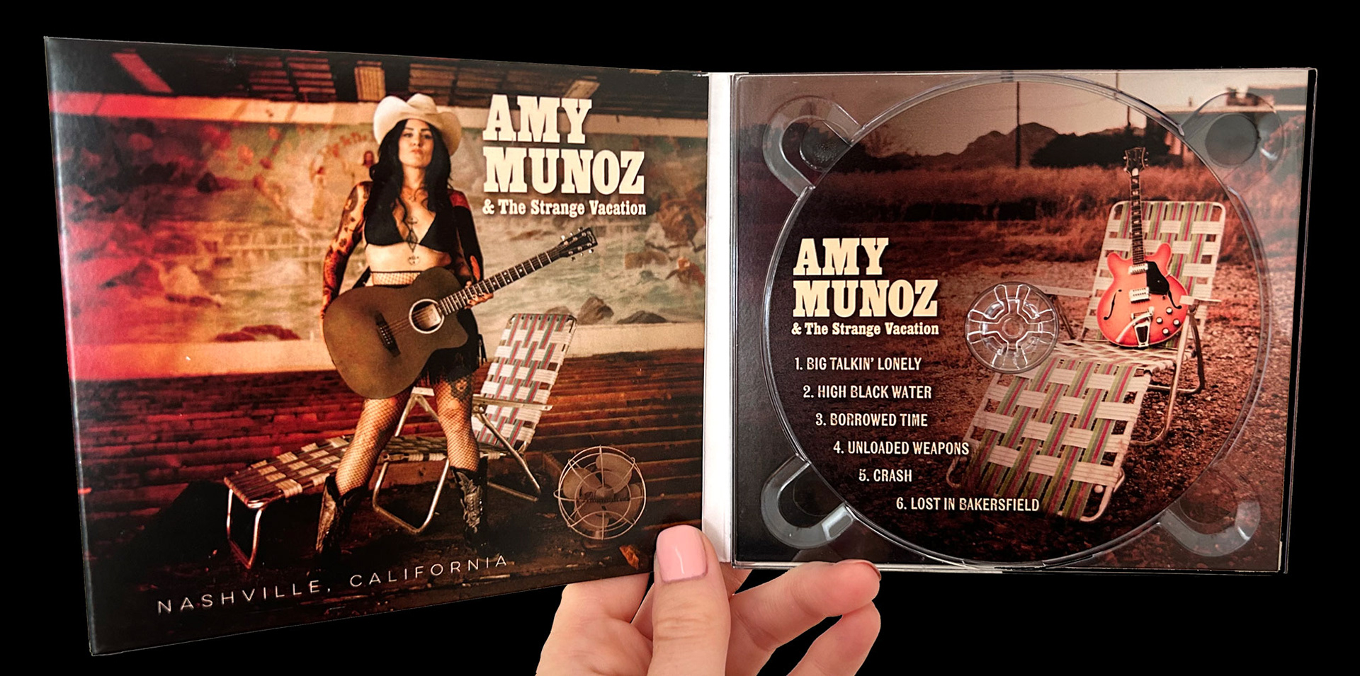
For the final design, I leaned into warm browns, reds, and tans to echo the music's earthy, intimate tone. Photography took center stage, keeping Amy and the band at the heart of the CD and vinyl packaging.
Typography played a big role in the process. At first, I tried some hand-drawn, edgier typefaces, but Amy was drawn to a more traditional Western-inspired typeface. That choice really brought the album title and visual tone together in a way that felt true to the music.
The album design concept was inspired by Kayla Von Der Heide's moody photography and the band's experience recording music at Sonic Ranch. The title Nashville, California, evokes a blend of country charm and Amy's rock influence, which I aimed to represent visually. The goal was to create a visual representation that would evoke curiosity and warmth, mirroring the album's auditory experience.

Option 1: Handwritten, Edgy Font

Option 2: Traditional Western Block Typeface
Design Process:
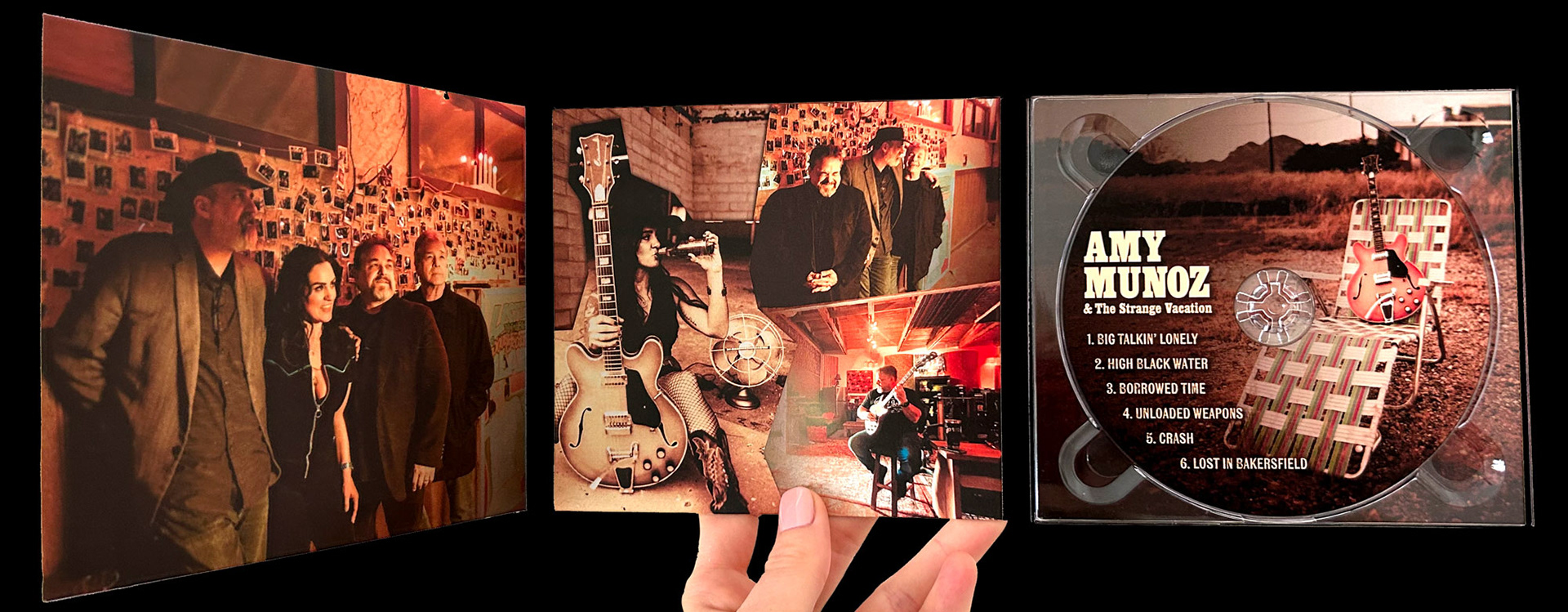
I started by listening closely to the album, soaking up inspiration from the lyrics, sound, and overall mood. From there, I played with layout ideas, typography, and ways to weave the photography throughout the entire album package.
Using Adobe Photoshop and Illustrator, I refined the artwork, adjusted colors, and enhanced the photography to create a seamless, immersive design. For one of the CD credit layouts, I created a new sky and adjusted the colors to add more depth.
Collaborating closely with Amy was essential to this project. Together, we reviewed ideas, refined the direction, and ensured the final artwork truly matched her vision and the album’s spirit.
Before and After

Original photograph

Edited art for the back of the album.
Before and After Image: Credits on CD
Original photo

I used Adobe Photoshop to create a new sky and color
Final Design
The finished CD and vinyl design for Nashville, California, brings together photography, warm colors, and Western-inspired typography to create a visual identity that feels grounded, expressive, and deeply connected to the music.
I prepared the finished album package for print, making sure every detail, from resolution to color fidelity, was just right for the printer.
Client: Amy Munoz
Photography: Kayla Von Der Heide
Photography Assistant: Katie Haverly
Album Design: Julie Bonner

Releasing new music or launching a creative project?
I design thoughtful visual systems for artists, musicians, and creative entrepreneurs, from album packaging and promotional materials to full brand identity development. Let’s create something that looks as good as it sounds.