Project Overview
For decades, Greater Tucson Leadership has supported the Tucson community through leadership education, civic engagement, and community development. The rebrand needed to reflect credibility, growth, and connection while remaining welcoming and grounded in Tucson.
The goal was never to leave GTL’s legacy behind. Instead, we set out to create a fresh identity system that could support the organization’s growing programs, events, and communications.
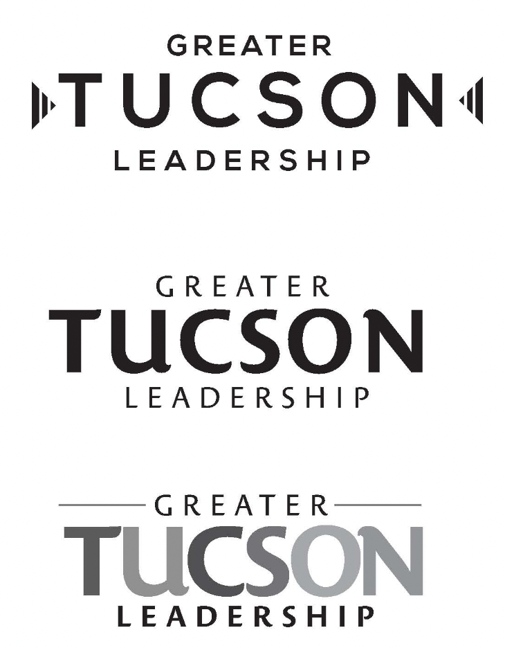
New Brandy Identity:
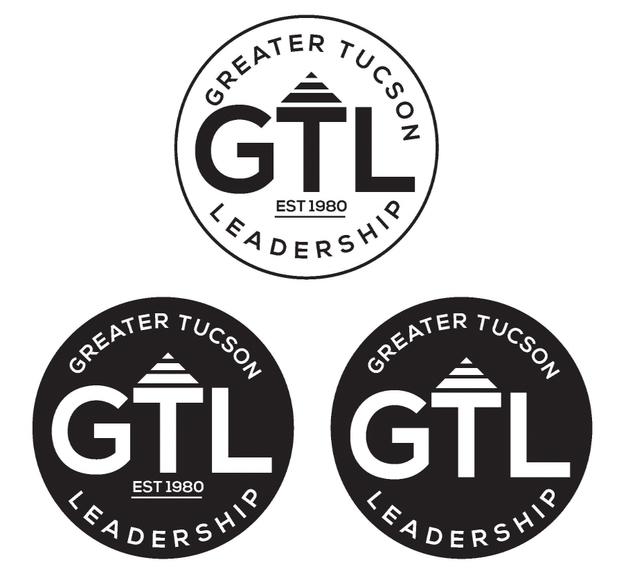
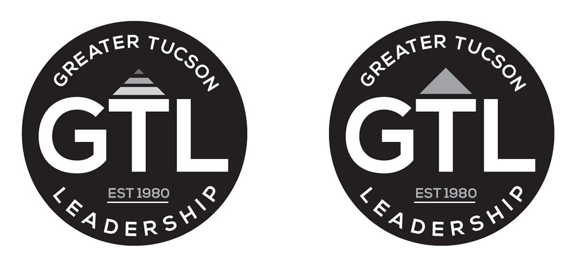
The final identity features a badge-inspired mark that celebrates leadership, community, and GTL’s history. The badge conveys strength and recognition, while the updated typography, color palette, and supporting elements give the brand a fresh, flexible feel.
We designed the new identity to work across all materials, from formal materials to program branding and event collateral.
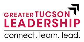
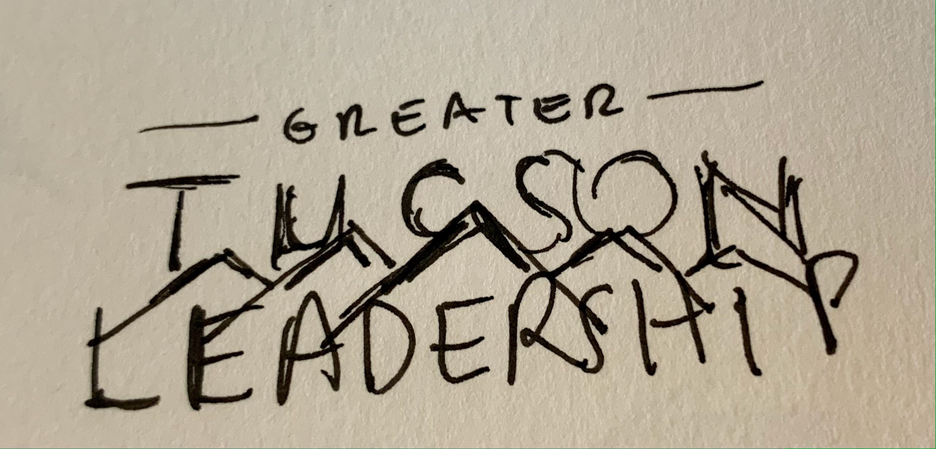
Old Logo
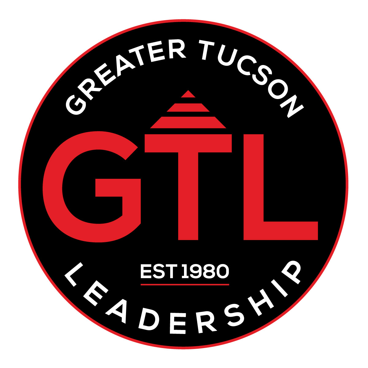
New Brand Identity
THE PROCESS:
(See below for visuals that illustrate the evolution from initial sketches to final brand applications)
Discovery and Direction
We started by looking closely at GTL’s current brand, mission, and visual needs. Since GTL brings together leaders, alumni, partners, and civic organizations, the new identity needed to feel professional, established, and welcoming to all.
Key goals for the rebrand included:
• Modernizing the existing visual identity
• Honoring the history and credibility of the organization
• Creating a stronger and more flexible logo system
• Developing brand variations for GTL’s different programs
• Building a style guide to support consistent future use
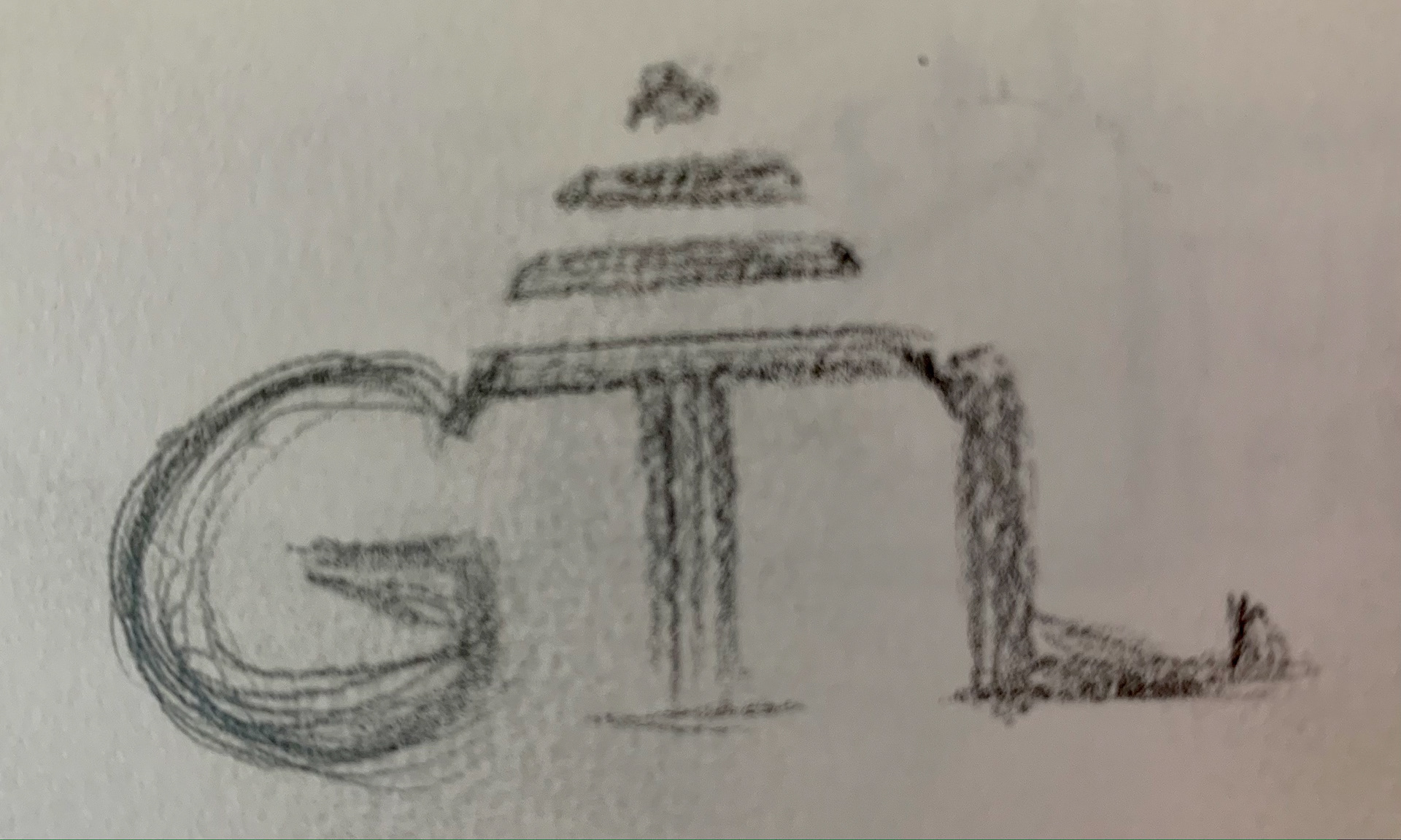
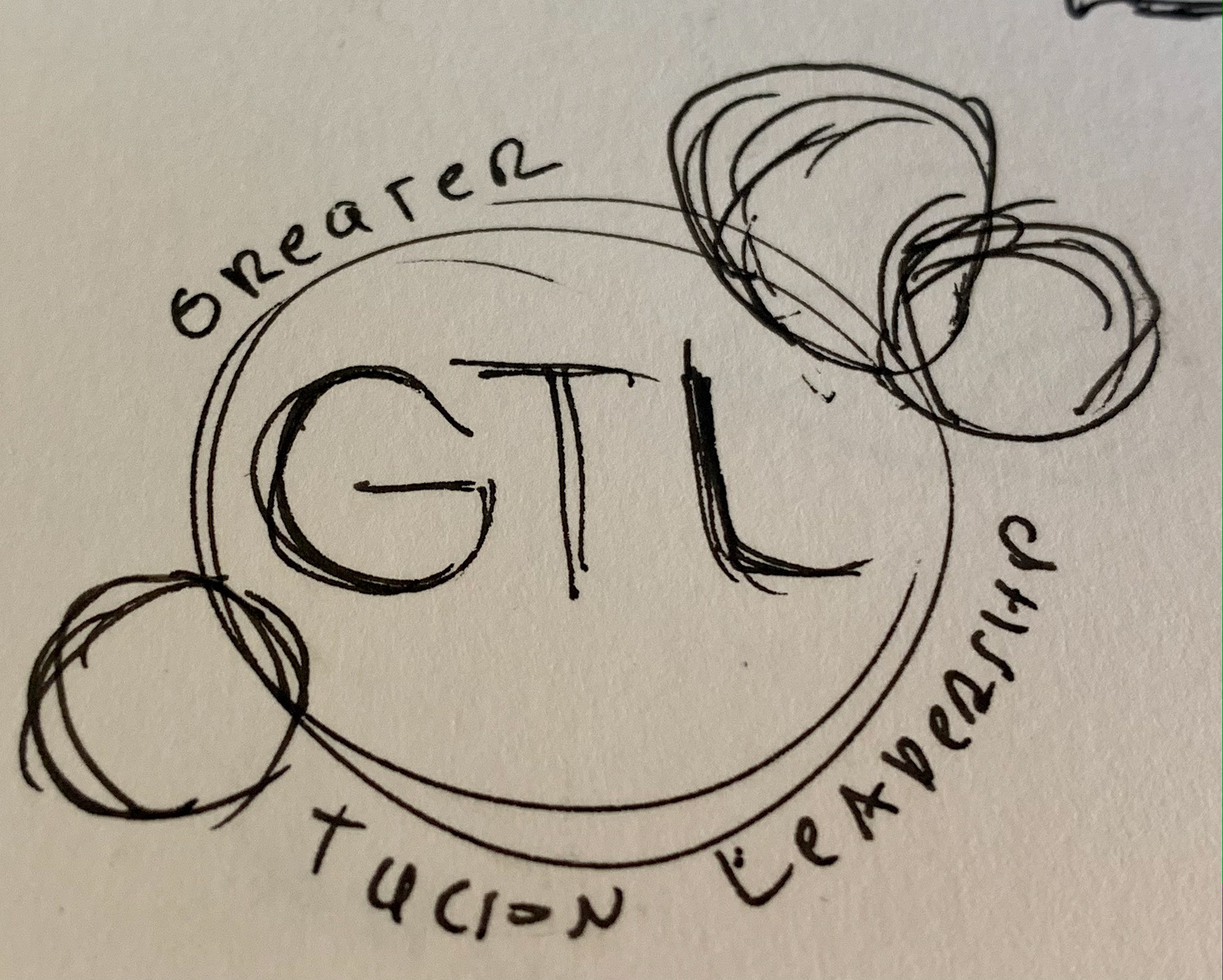
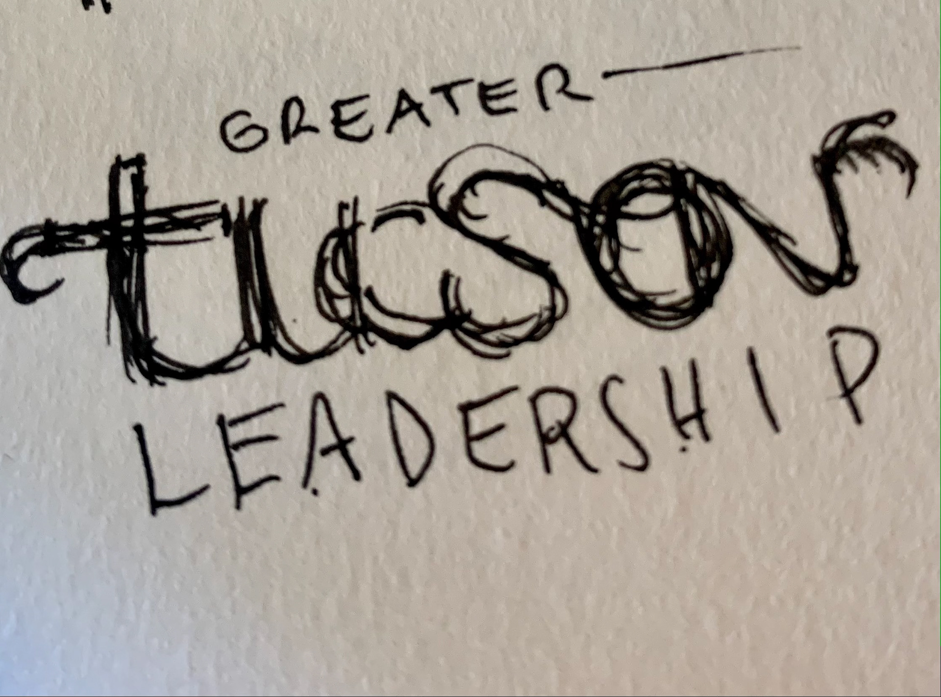
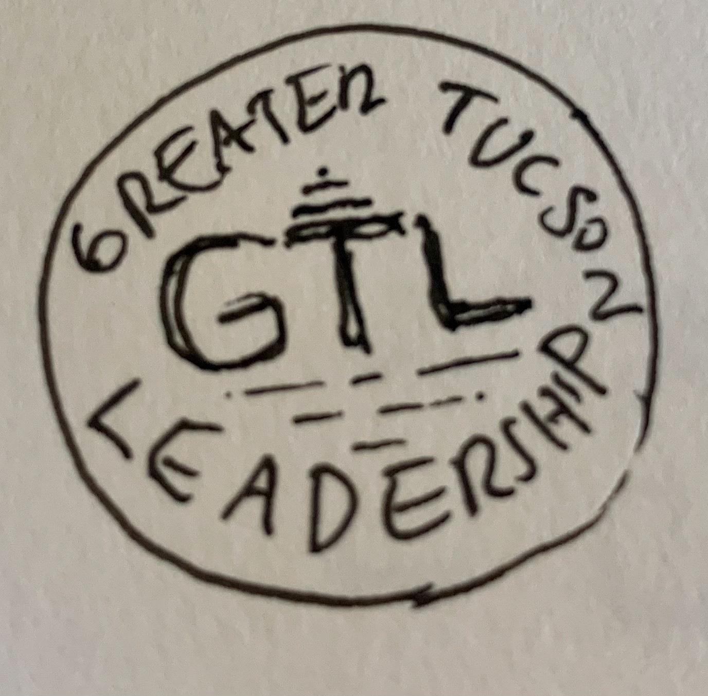
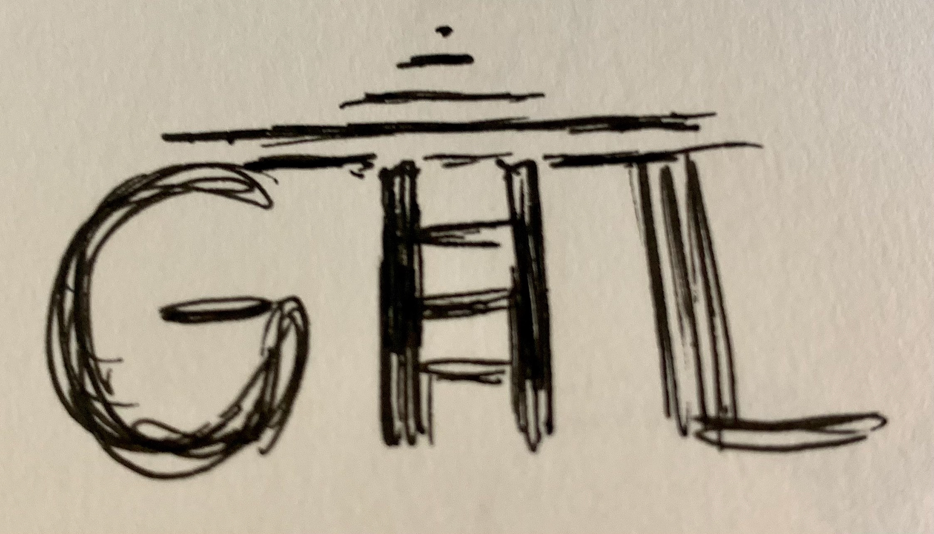
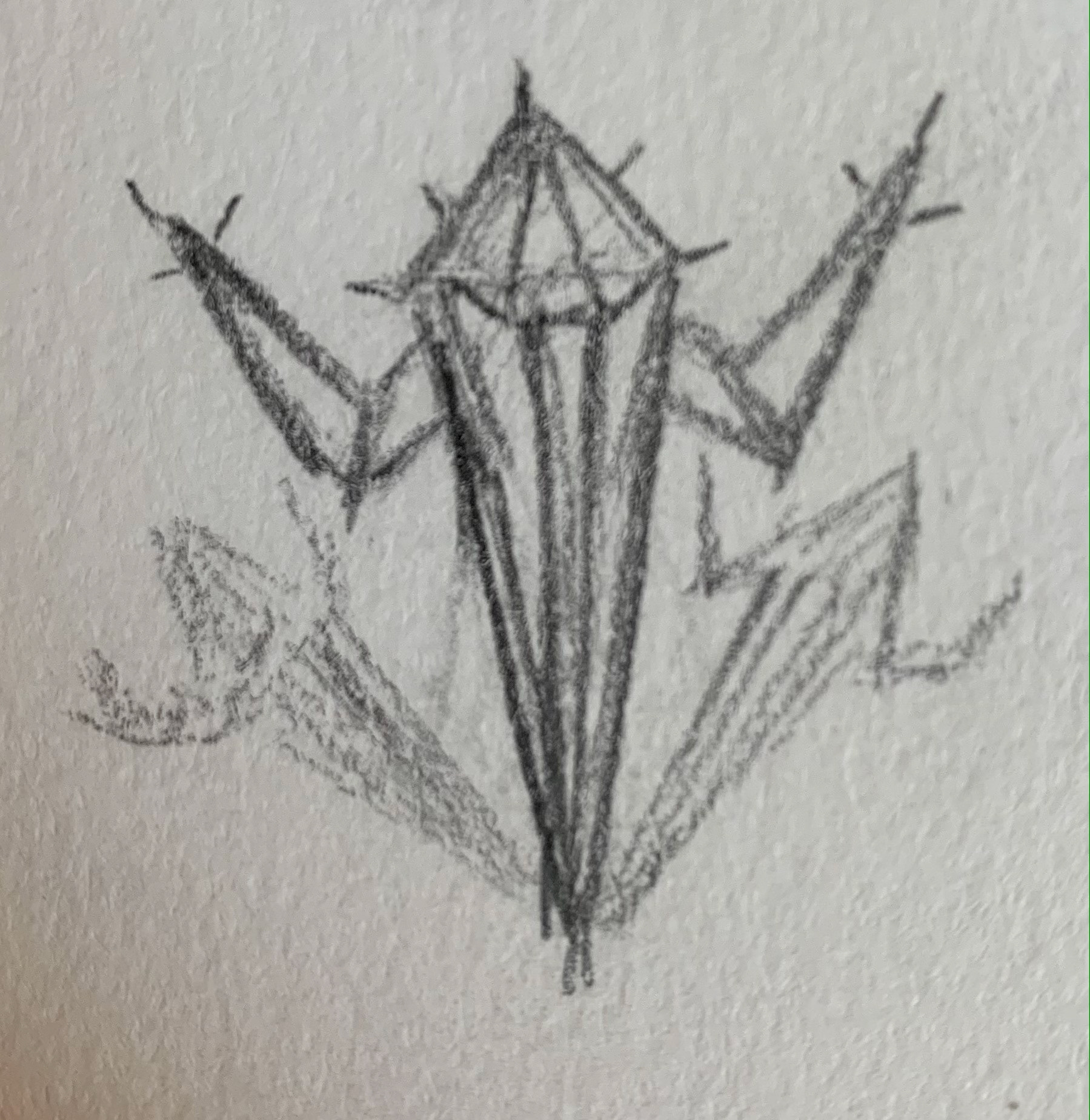
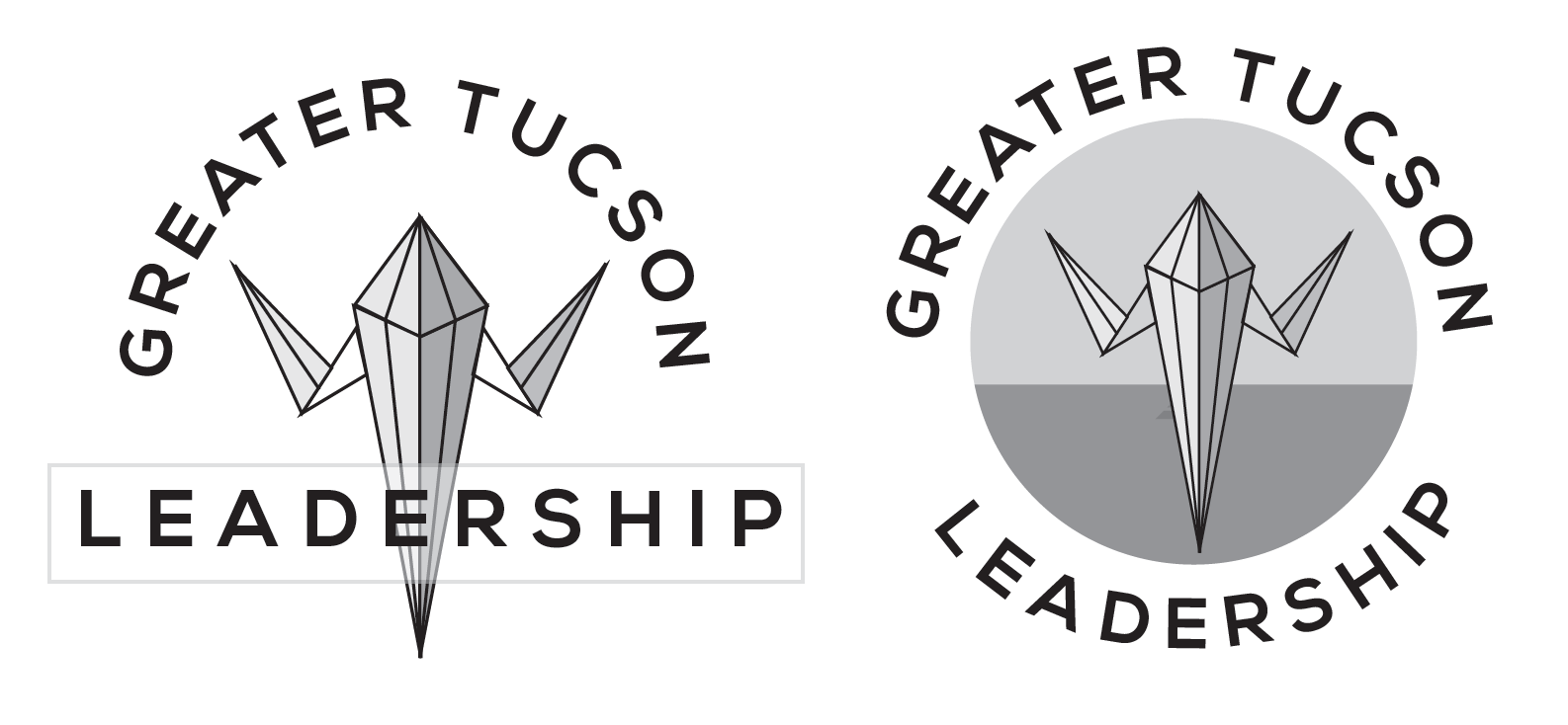
Thumbnail Sketches
In the early sketching phase, I explored visual ideas inspired by leadership, growth, connection, Tucson, and civic engagement. These quick thumbnail sketches made it easy to test out different directions before moving into digital concepts.
This stage was key because the final identity needed to stand out without feeling trendy. The mark had to balance tradition with a sense of progress.
SOME OF THE INITIAL CONCEPTS:
I explored several early logo concepts, each offering a different take on leadership and community. Some ideas were more symbolic, while others focused on badge shapes, typography, and structure.
At this stage, I evaluated each concept for:
• Readability
• Professionalism
• Flexibility
• Connection to GTL’s mission
• Ability to work across multiple programs
• Long-term brand recognition
After narrowing down the strongest concepts, I refined the visual direction into a badge-based identity. The mark evolved through several rounds of tweaks to improve proportion, hierarchy, typography, and balance.
This phase was all about making the identity feel confident and polished, while keeping it practical for everyday use.
REFINEMENT & ITERATIONS
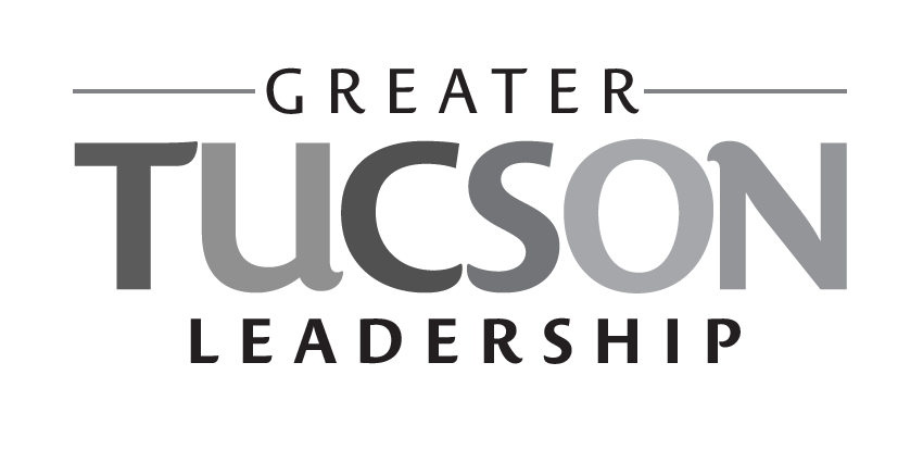
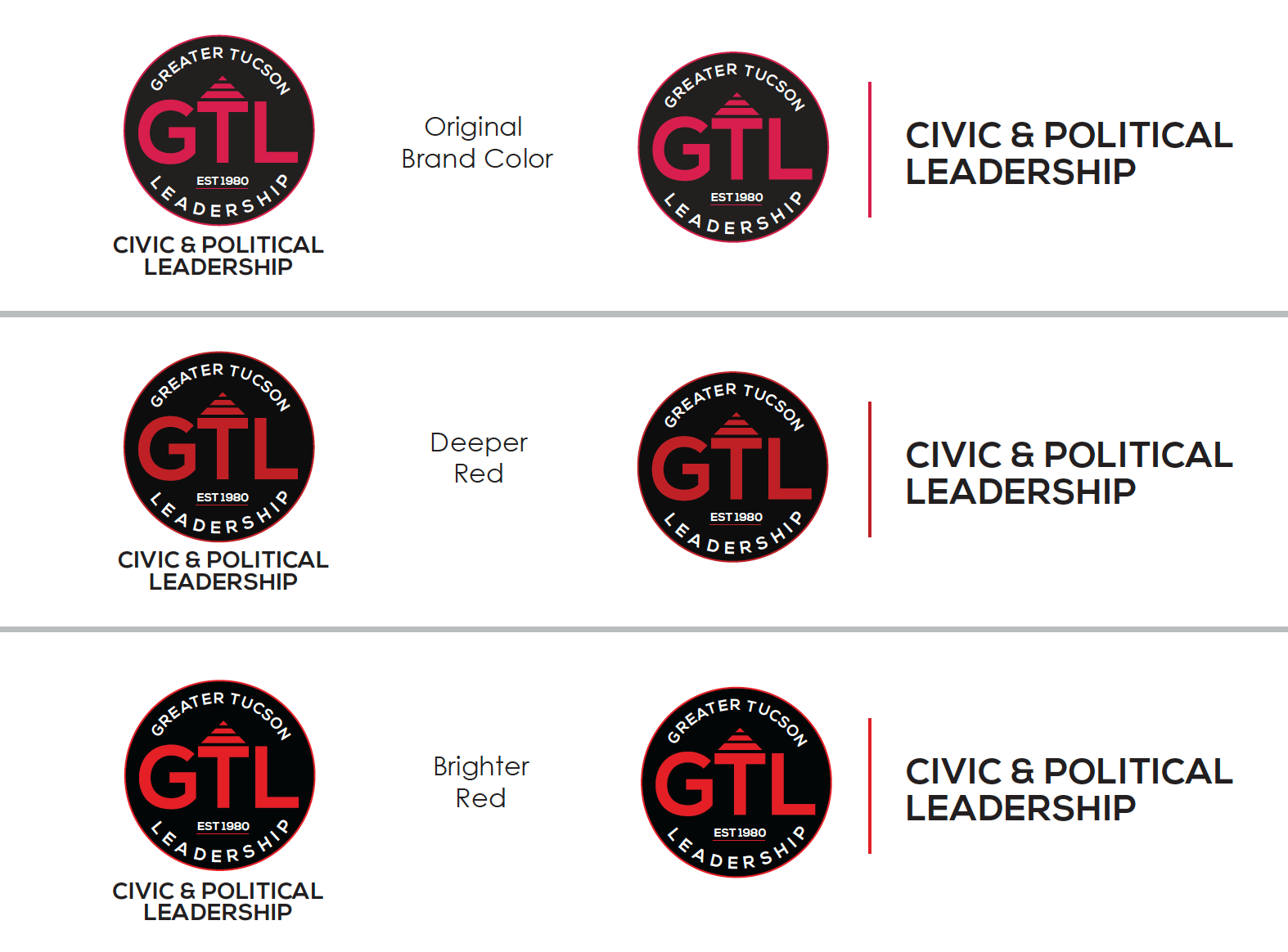
COLOR EXPLORATION
Exploring color was a big part of shaping the brand’s tone. The palette needed to feel civic, trustworthy, and modern, but also energetic enough to support leadership programs and community engagement.
The final color choices helped the brand feel established, optimistic, and truly connected to Tucson.
COLOR REFINEMENT
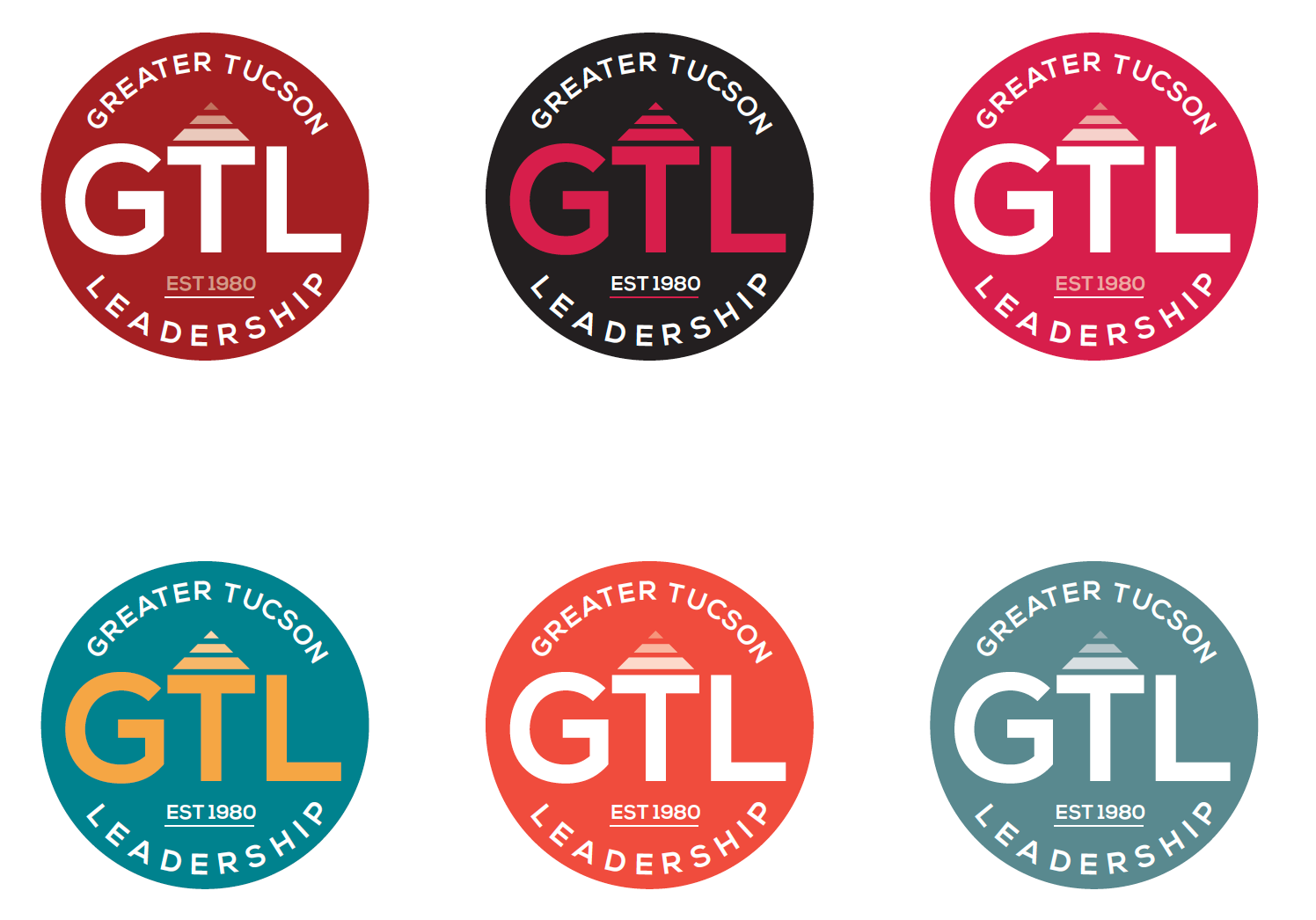
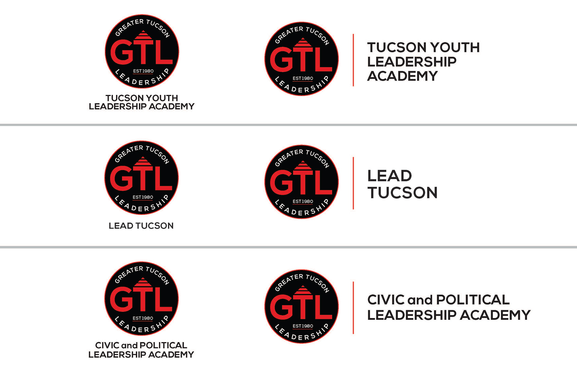
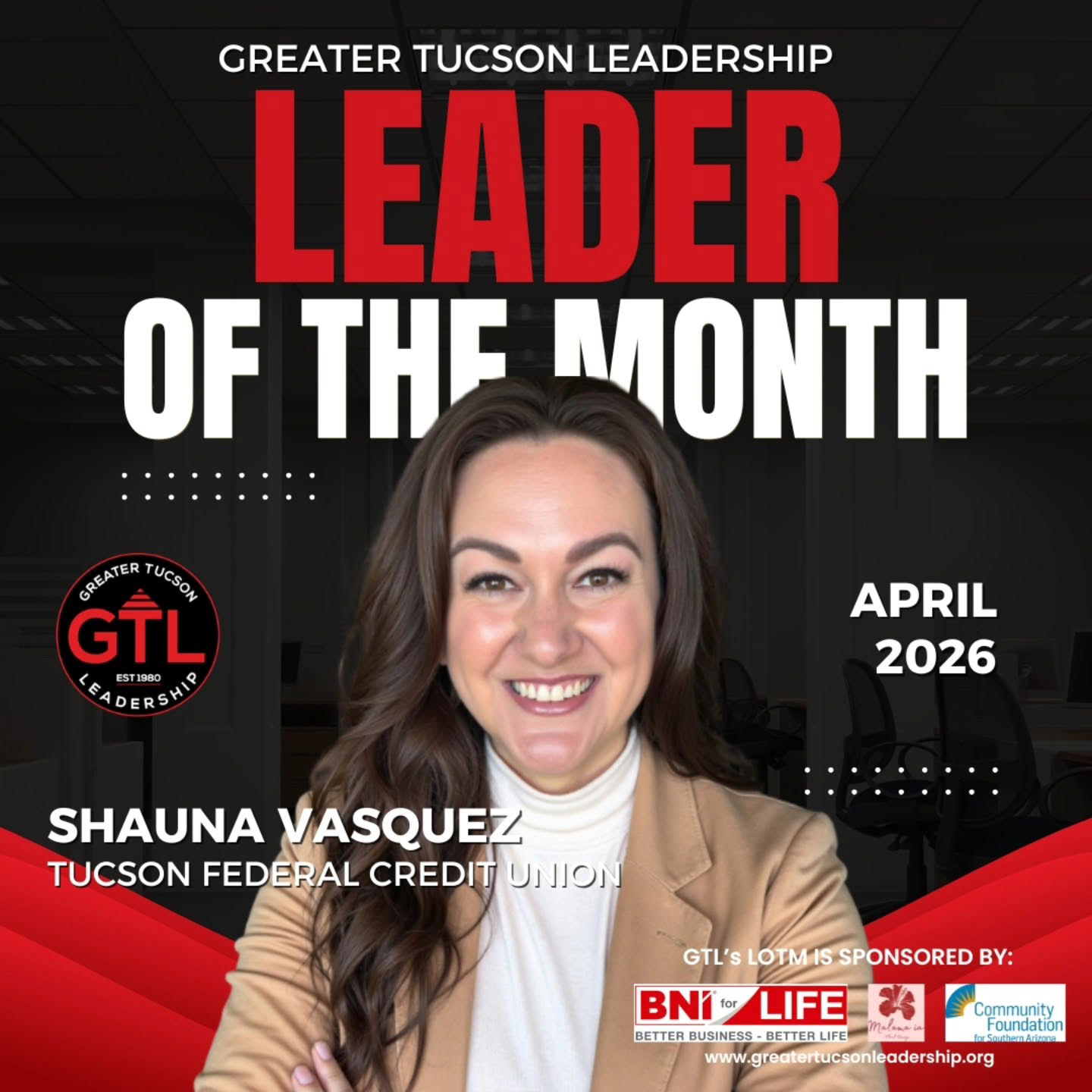
FINAL VARIATIONS FOR GTL'S DIFFERENT PROGRAMS:
Since GTL runs multiple programs and initiatives, the final identity system included variations that could flex across the organization. This approach gave GTL a cohesive brand family while allowing each program to maintain its unique presence.
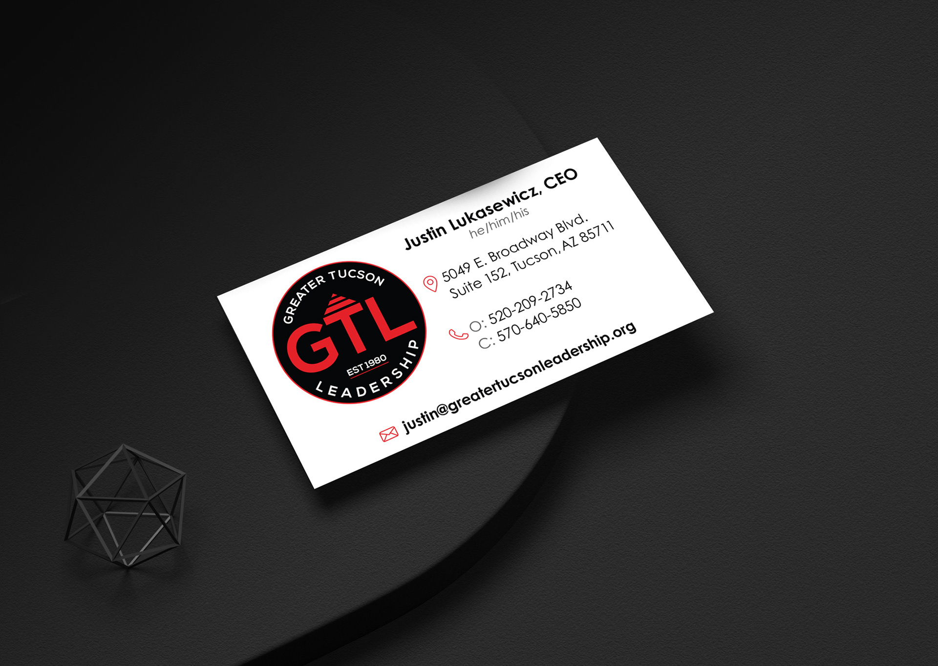
BUSINESS CARD CONCEPTS
Business Card Concepts
The business card concepts were a chance to see how the new identity would work in print. These mockups helped test the logo, color palette, and typography in a real-world format.
Final Business Card Design
The final business card design gave GTL leadership, staff, and representatives a polished, professional touchpoint. It brought the new identity system to life in a clear, usable way.
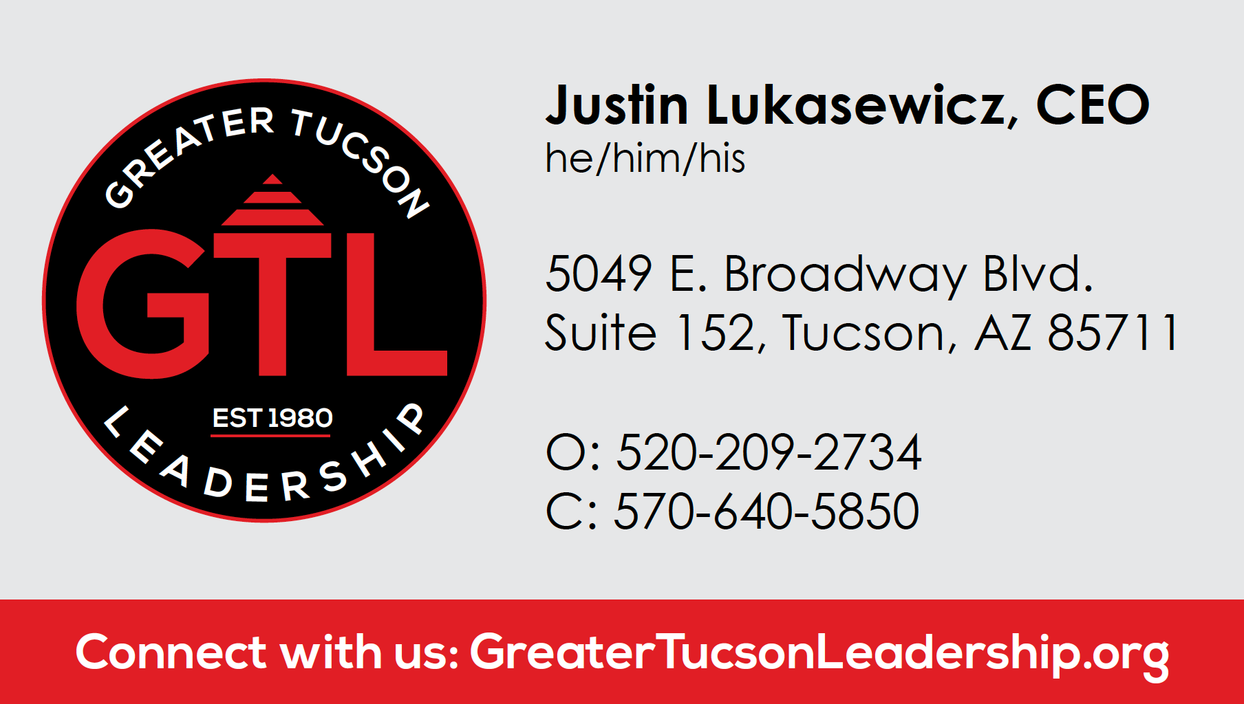
FINAL DESIGN FOR FRONT OF BUSINESS CARD

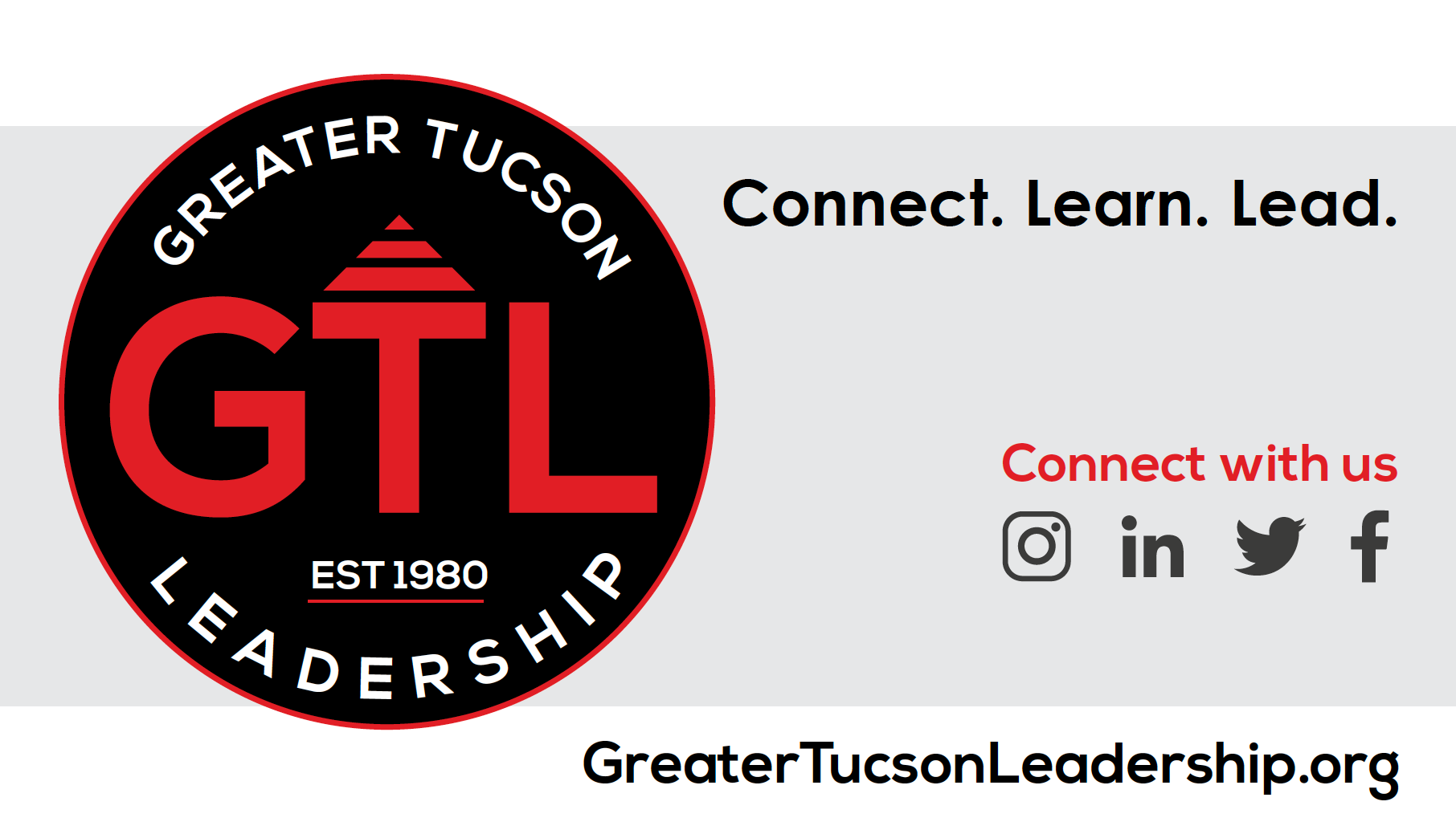
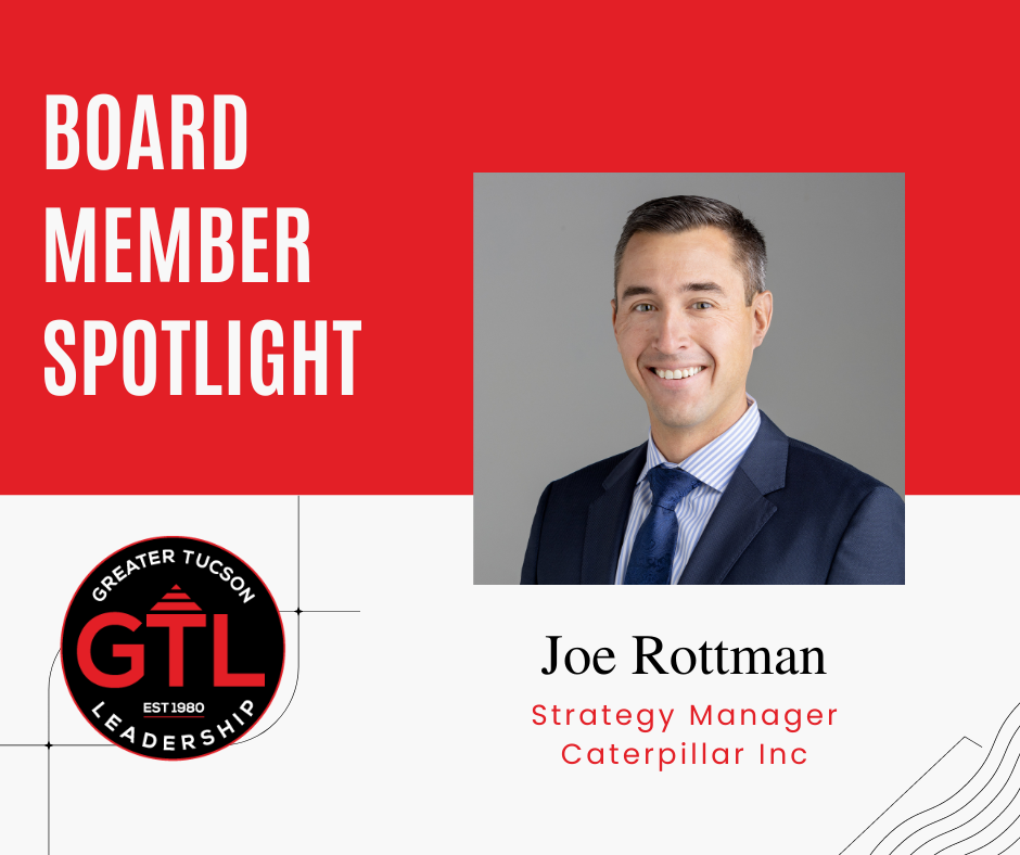
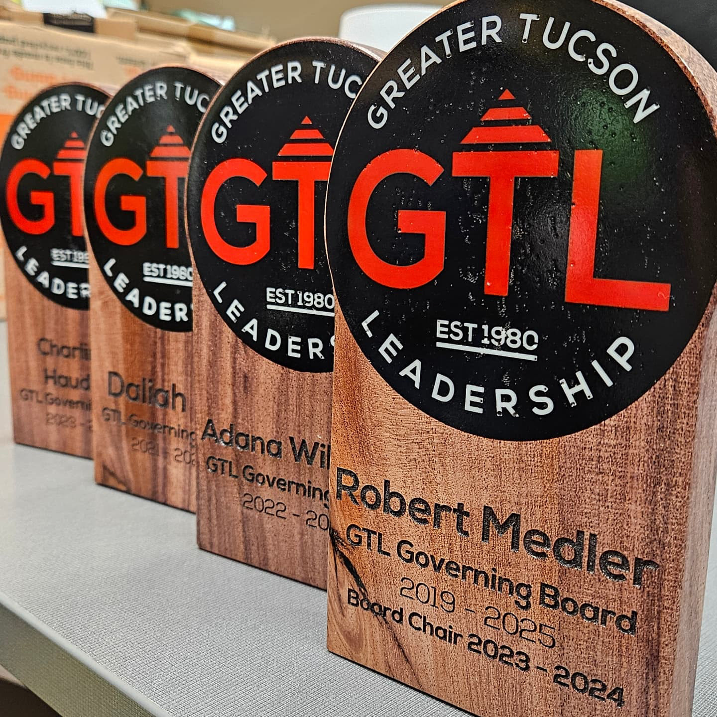
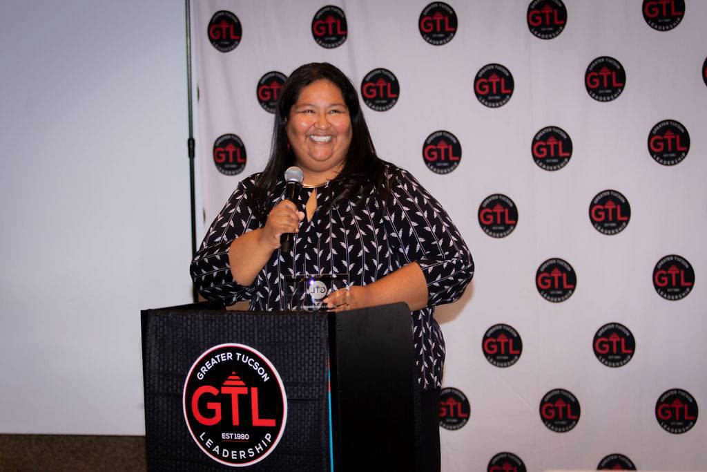
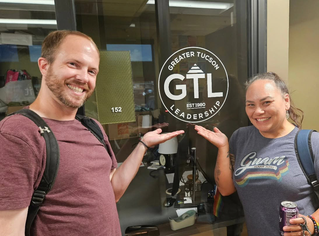
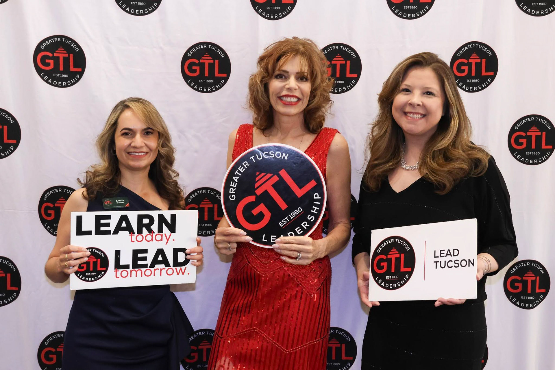
NEW BRAND IDENTITY IN USE
The completed rebrand gave Greater Tucson Leadership a more unified visual presence across all its materials. The new identity system was built to support print, digital, and program branding, as well as future growth. Early feedback from GTL’s board and community partners was overwhelmingly positive, with several members noting increased clarity, professionalism, and pride in the organization’s renewed image.
Deliverables
This rebrand campaign included:
• New brand identity
• Logo system and variations
• Program-specific identity variations
• Color exploration and final palette
• Typography direction
• Final business card design
• Brand style guide
Collaboration
Working with Justin Lukaswicz of Greater Tucson Leadership on this rebrand was a true pleasure. This project reinforced the importance of close client collaboration and iterative design in nonprofit branding. It was rewarding to see how intentional design choices helped GTL celebrate its heritage while positioning it for future growth. Together, we created an identity system that honors GTL’s legacy in Tucson and sets the stage for its next chapter.
Let’s build a brand that reflects where you’re headed.
From logo development to full brand identity systems, I help businesses, nonprofits, and creative entrepreneurs create polished, strategic brands that feel clear, memorable, and ready to grow.
Contact Julie about future branding work.